Creating a flyer is a common task for businesses, non-profit organizations, and academic institutions. An advertising flyer’s primary purpose is to advertise an event, idea, product, or service. A well designed and thought out flyer provides information that convinces the viewer to attend an event or buy a company’s product or services. A flyer uses both imagery and text to get its creator’s primary message across and can be used for email, print, and web distribution.
Planning a Flyer – Developing the Call to Action
Prior to the flyer creation’s creation phase, developing the ‘Call to Action’ topic is required to properly purpose a flyer to ensure the best results are achieved. Choose the primary reason for creating the flyer in order to give it focus. This can be promoting a specific event, product, or service. A common mistake that organizations make is to create a flyer that has too broad a purpose, causing it to lose the target audience’s focus. This results in the flyer giving less than optimal performance. During this stage of the flyer creation process, a draft title should be developed that highlights the “Call to Action.”
Refining a Flyer’s Call to Action
Once a draft “Call to Action” is developed, the draft verbiage needs to be refined in order to properly target the desired consumer base. Even if the flyer will only be used for print distribution, refining the flyer’s “Call to Action” title through Internet research will increase the flyer’s effectiveness. Additionally, properly optimizing flyer verbiage will enable the content to be used across the various media available to organizations without major re-work being required. In order to do this, a persuasive title to get the reader to continue viewing the flyer should be created. The words in the title should relate to the overall event, product, or service being advertised. If the flyer is going to be used online, the relevant keywords should be included in the title chosen for the flyer.
Convincing the Consumer to Take Action
The remainder of the verbiage on a flyer should focus on convincing the consumer how the product or service will solve a problem they have. If the flyer is for an event, then the focus should be on what will be gained by attending the function. When wording the flyer, the message should be presented in terms of “You” so that it is directed at the desired customer. The message should be clear regarding what the reader should do as a result of reading the flyer, whether it is to order a product, visit an organization’s website, or attend an event. The flyer’s purpose is to get the consumer to take action by purchasing something, visiting a website, or attending an event they might not have otherwise. A maximum of two to three fonts should be used for the flyer’s text to prevent the layout from appearing to be too confusing. The supporting text should not exceed three sentences to prevent losing the reader’s interest.
Designing the Flyer Layout
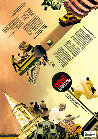
Sketch the flyer layout before moving to the creation phase. Competitive flyers now incorporate digital photography and/or illustrations to get the consumer’s attention and get an organization’s message across more effectively. The design should have a visual focus – a high-quality image. When planning the flyer’s design, the picture or illustration should be in the flyer’s upper half. When consumers view flyers or websites, their eyes are naturally drawn to the upper half of the page with emphasis on the left side for people from countries that read left to right. If targeting a population that reads right to left, shift the emphasis to match. Relevant contact information should be included on the flyer so the consumer has a means to follow up or take action. If the organization creating a flyer has a logo, it should be incorporated into the design near the flyer’s title to ensure proper branding.
How to Use Imagery in a Flyer
Using a single, large image is proven to make a stronger impression on viewers than numerous small pictures. If using small pictures, they should be grouped together so that they are perceived to be a single group of images. A small image can also be juxtaposed with a larger one to give a contrasting appearance on the flyer. The end result should be to draw a viewer’s interest and keep it long enough to read the flyer’s “Call to Action” and supporting information.
Finding Imagery to Use in a Flyer
Most organizations do not have the funding or workload to keep a photographer on staff. As a result, using photograph stock exchanges is a popular way for organizations on small budgets to acquire imagery for commercial projects. Stock exchanges that permit unrestricted picture use normally require citation of the original photographer when reusing the image. Three large stock exchanges that permit commercial imagery use are:
- MorgueFile – MorgueFile is one of the largest picture archives available that can be used for commercial projects.
- FreeRangeStock – Over 2000 stock photos with resolutions over three megabytes available for commercial projects.
- BigFoto – A stock exchange in which the photos are stored by location and theme that can be used for commercial purposes with attribution to the original photographer.
How to Make a Flyer in Microsoft Word
Step 1 – Open a new document by selecting File->New-> Blank Word Document from the file menu in Word.
Step 2 – Create the flyer border by selecting the Border->Borders and Shading from the file menu. Depending on the version of Word, this menu choice’s location can vary on the File menu. Select the Page Border tab on the dialog box that appears in the application and choose the menu in the art box. Pick a border to put around the flyer being created and adjust the width and color to match the flyer design in the same tabbed options panel.
Step 3 – Insert the flyer image by selecting the “Insert->Image” option from Word’s file menu. To re-size the image, left click the image on the document and drag the corner of the image in or outwards to meet the desired size.
Step 4 – Insert a text box into the document by selecting the “Insert->Text Box” menu option. Left click the document on the left side of where the text box should be inserted and type the document’s title into the box. Highlight the text and choose the desired Font Format, style, and size from Word’s Font menu. After the title is finished, insert additional text boxes as needed.
Step 5 – Select “File->Print Preview” from the primary file menu and preview the flyer’s look and feel. Make changes as needed.
Step 6 – Save the Flyer in Word Document format in order to print the flyer. To create Web Versions of the flyer, select the “Save As Web File or .HTML” menu option in the “Save As” file menu option. PDF is another option for creating an Internet or email-safe version of the flyer. A PDF burning print driver must be purchased or downloaded in order to create the PDF.
How to Create a Flyer in Adobe Photoshop
Adobe Photoshop is one of the premiere tools on the market for creating visual media. It can be downloaded and used for free for 30 days. Unlike other multimedia tools, Photoshop does not include a “Trial” watermark in work produced while being used in a trial status and is a powerful tool for creating flyers. These steps highlight how to use the basic tools in Photoshop to create a flyer:
Step 1 – Create a new document in Photoshop and input the following parameters for the document:
- Width – 8 Inches
- Height – 10 Inches
- Resolution – 300 pixels/inch
- Background – White
If the flyer is going to be used for the web or email, decrease the resolution to 72 pixels/inch and the image size to 400 x 600 pixels to ensure that the consumer can view the flyer before closing the web page or email.
Step 2 – Open the primary image that will be used for the flyer.
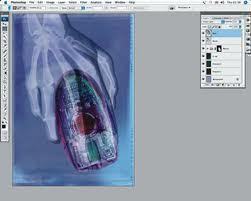
Step 3 – Select the entire image and copy it to the clipboard by selecting the file menu option (File->Edit->Copy) and paste it into the document created in step 1. Photoshop will automatically create a new layer for the image. Repeat this step for each image that will be used for the flyer. A logo image and a background image are normally used on flyers.
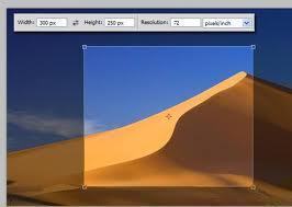
Step 4 – Scale the image to fit the flyer’s size by using a scale transformation to complete resizing the picture. This size will be no larger than the document parameters entered in step one.
Step 5 – Insert Text on the Flyer by inserting a text box into a new layer. The text can be inserted as one large text box to include the title or by using a separate box for each section of text. Format the text by selecting the text layer and modify the font size, type, and other features in the font toolbar.
Step 6 – Save the flyer in PSD, PDF, and JPEG format by selecting the “File->Save As” file menu option and changing the file type by using the drop down menu on the File menu.
Using Flyer Templates
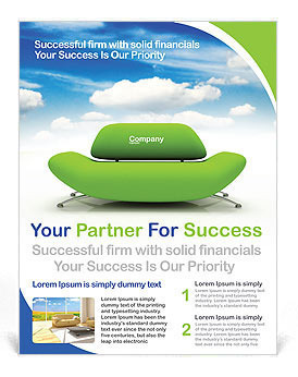
Flyer templates are readily available in Microsoft Word as well as Adobe Photoshop. Using a good flyer template can prevent the user from creating a flawed design and ensure that the organization portrays the proper message. The following are three resources for obtaining flyer templates:
- Microsoft Office Online Flyer Templates – Microsoft provides templates for all office products online to augment those that come with the purchase of the office suite that can be downloaded from within Word or directly from the Office website.
- FlyerTemplates.org – FlyerTemplates offers a small selection of free flyer templates for download.
- Stock Layouts – A great commercial resource for professional flyer templates. The templates generally run just under $100 USD.


Debbie Stanley
Great tips, thanks a lot!
Ayah Spencer
i need to make a flyer that can advertise a non profit organization
Abdulqader Kapadia
Ayah, I’m sure one of the above listed software will help you do so.
D And D Service
Need to make a flyer
Alexandra
And I used snappii.com to make apps. I don’t have programming skills, snappii service allows make custom apps in minutes!
Adriana
Hello,
I think you should also mention the bleeding area (3-5mm to each side).
I like this article very much and I find it quite useful. Right now I am trying to build a flyer and I need information in this field – this is how I came across this.
Anyway thanks!